

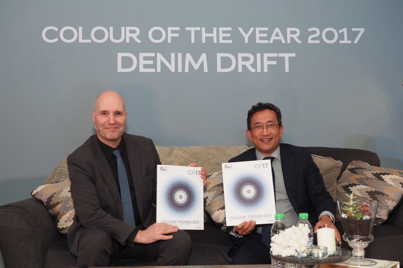
AkzoNobel, the leading global paint and coatings company and manufacturer of Dulux announced the launch of its annual trend forecast, Colour Futures™, depicting key colour trends for the year ahead and its prediction of the Colour of the Year.
The leading paint brand’s team of global trend and design experts create the forecast after reflecting on emerging trends in people’s lives from interior-design and architecture to fashion, beauty to graphic design and social and economic influences.
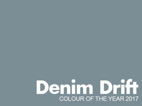
The blue we expect to see everywhere in 2017 is the ‘Denim Drift’ (also known as Smoke Grey). A beautiful, timeless and versatile steel-blue that takes on different and durable characteristics – perfectly capturing the mood of the moment and embodying our lives for 2017. Fitting into all life and interior styles, ‘Denim Drift’ is the must-have colour of 2017.
Heleen van Gent from AkzoNobel’s Global Aesthetics Centre said “Denim Drift is a wonderfully diverse foundation for the 2017 colour palette, which tells the story of our ‘life in a new light’ trend through its vast range of tones and colours. With blue set to dominate the interior trend agenda for 2017, Denim Drift does a fantastic job by representing the times we live in, designers love it and so do we.
“Denim drift and its complementary colour palette will set off your walls in a beautiful way. There is a colour combination for everyone’s taste and preference within the palette, with denim blue as our favourite.”
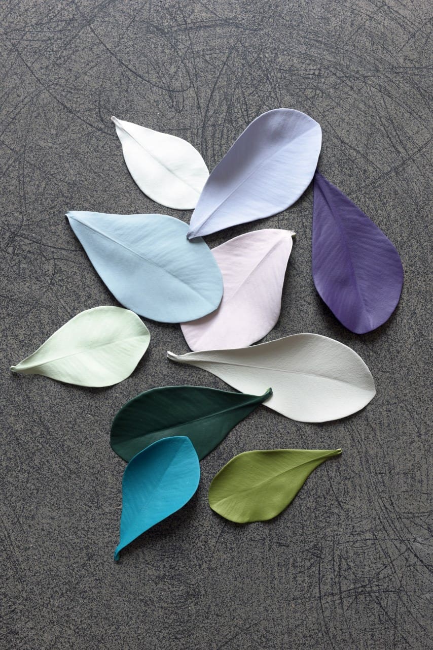
To complement the Colour of the Year, AkzoNobel has developed a family colour palette featuring a spectrum of blues and tones – creating a new way to combine colour. We see different proportions of darker and lighter blues that change the mood of a room or space.
Denim Drift combined with a few of the lighter shades has a crisp and airy feel, whereas with a darker colour it’s more dramatic and moody. There is a huge variety of ways to apply this colour according to these palette groups.
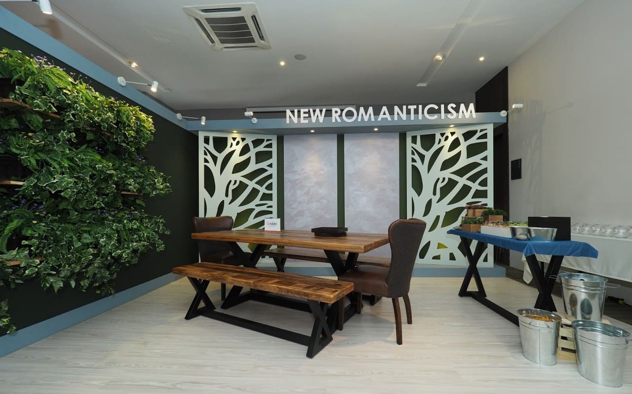
New Romanticism – As the world becomes more passionate and vocal about issues surrounding the environment, this topic infiltrates the way we are living and our priorities in life, with sustainability and responsibility front of mind. Although this trend comes from a place that is deeply considered, the New Romanticism palette translates into our homes in a boho, eclectic fashion that immerses you in the natural world and transforms your home with a truly creative flair.
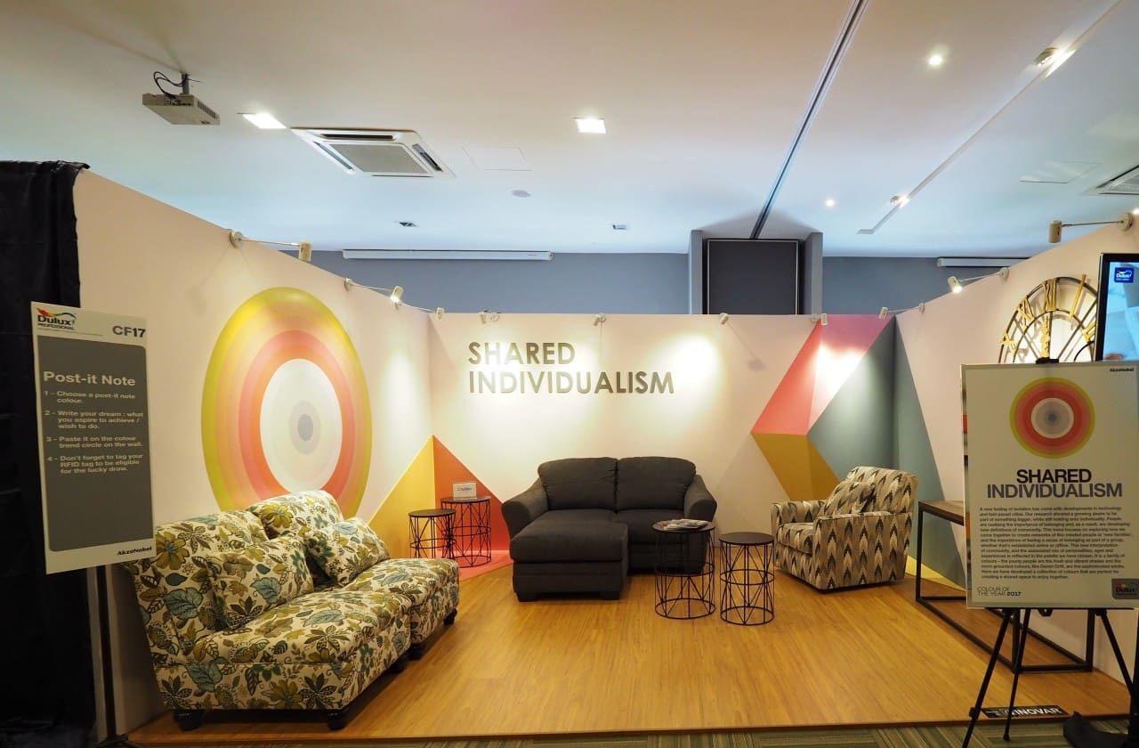
Shared Individualism – Cities are growing, demographics and social settings are changing, and so the importance of having a sense of belonging and being part of a group is increasingly relevant. AkzoNobel has observed the way in which individuals come together to create a network or family, whether that’s friends, relatives or a wider community of like-minded people and share their ideas, dreams and spaces. This colour palette has a fresh and playful mood which is perfect for creating a shared space to enjoy together.
The Working Home – The boundary between work life and personal life is shifting, and as such we seek a more balanced way of living and working. The home has become an office, and offices are becoming more like homes as we are living 24/7 lives, we need beautiful spaces to work at home, and new inspiration for how to do this. Whether you like to take your laptop to the kitchen with a coffee, or carve out a specific area for working, you can be comfortable, relaxed and focused within your living space with AkzoNobel’s The Working Home colour palette.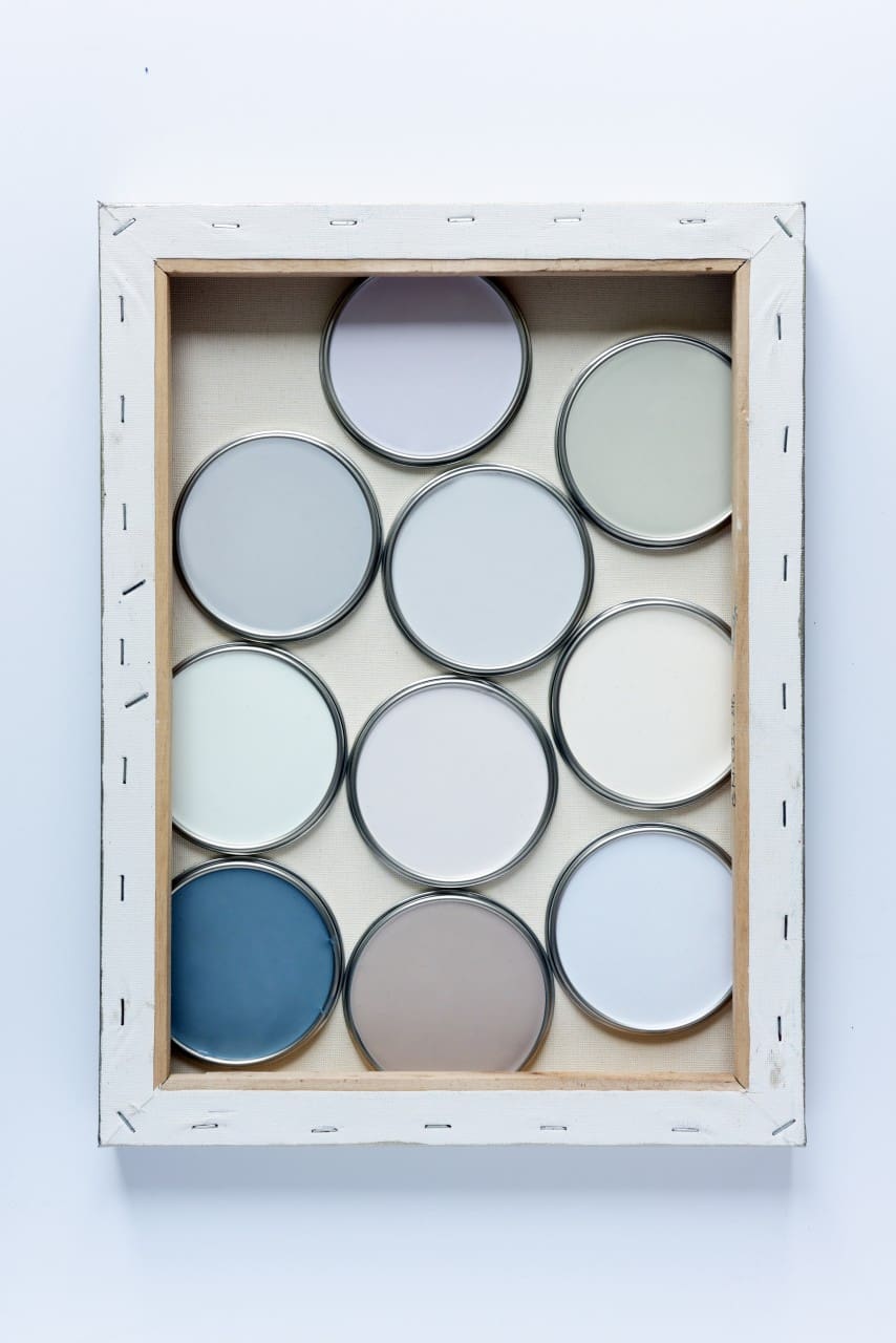
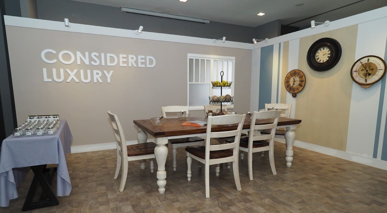
Considered Luxury – This trend captures a new way of living where value is placed on experiences rather than possessions. Creating memories that are priceless becomes a priority as we look at the world with fresh eyes, not adding clutter but experiences instead. It is the new way of consuming: buy less, choose well and make it last.
For more information about Colour Futures™, log on to the Colour Futures™ website here.